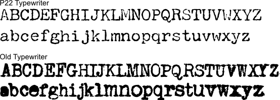
You have probably seen text produced by computers in fonts that are meant to look like they were typed on typewriters. The word “bookselling” caught my eye in a presentation by Lawrence Lessig. I’ve rendered a blown up version here in P22 Typewriter, the font he used in his presentation.

Here is “bookselling” rendered in another typewriter font, Old Typewriter, which is a similiar, but more extreme, example.

I was struck by the fact that while the font looked messy, it was consistently messy. The back-to-back o’s and l’s in “bookselling” are perfect copies of each other. No typewriter would have produced identically messy letters. However, because they are produced using a computer, the distortion is perfectly consistent between instances of a given letter.
To appreciate the revealing error, you must understand that the process of printing with inked pieces of metal type is messy. In letterpress printing, ink is rolled onto type using rollers or inkballs. In typewriters, letters are inked individually or the ink is pressed onto the page through an ink soaked ribbon. The result in both cases is letterforms that are slightly deformed due to irregular application of ink to type, globbing of the ink, the rough texture of the paper, and the splattering of ink across the page when the type hits the page. In part to prevent confusion due to these errors, typewriter typefaces employ exaggerated serifs to make each letter’s form more distinct and resistant to distortion and noise.
However, on a computer screen or on a modern printer, letterforms are perfectly reproduced. Printers and screens build letters out of patterns of dots in tiny grids. The dots making up letters are precisely placed and microscopic. Screen don’t splatter ink. In order to present an accurate typewriter font on screen or to be printed by a modern printer, font designers must also represent the types of errors that typewriters would make. You can see the messiness clearly in typewriter font samples.

However, just as the sloppiness of typewritten documents reveals the typewriters that produced it, the computer reproduction of that error introduces another revealing mistake. While most letterforms produced by a typewriter are malformed, they are uniquely malformed. Like snowflakes, each letter printed by a typewriter is subtly different for every other letter. The computer reveals itself by reproducing the same messiness of a letterform each time it is reproduced.
A typewriter might produce the first o; in fact, a real typewriter was probably the source of that letterform. But no typewriter would produce that o identically twice. That takes a computer. To be very convincing, a typewriter font would need to produce different versions of each character or to distort them randomly. I’ve been told that there are now fonts that do exactly this.
While the imperfections of the typewritten characters reveals a typewriter, the reproduction of these errors with perfect verisimilitude reveals a computer. In the process of trying to emulate the errors created by a typewriter, the computer commits a new error and reveals the whole process.
As I was reading this, I thought of the same thing, that there are many fonts that have ‘alternative’ letterforms. So you could have an ‘aware’ program that would alternate between ‘o version 1’ and ‘o version 2’ to add more ‘randomness’. But this raises an interesting idea: a library that could randomize parameters on each letterform to produce output with unique letterforms where no two outputs would look the same, each message would have a unique fingerprint. There are already free software programs to improvise music (lisp iirc), why not apply that to fonts!
The biggest barrier seems to be the fact that, to do this well, you need changes to the font standards that we use. Simple True Type fonts, for example, can’t handle these features.
In the typefont samples, why is the lowercase ‘d’ missing?
Jess: I have no idea! I had not noticed it before now!