Precision Expiration

Here is a photograph (and a closeup) of a bag of pretzels I was given on a cross-country plane trip today.

Bag of Synder's Pretzels Big and Closeup

When I first saw “May 11 DC20 2008 00:12,” I thought, “Wow! That’s an extremely precise expiration date!” In transit over several time zones I then thought, what time zone do they mean?

Of course, expiration dates are ballpark figures that mark thresholds in the gradual process of product degradation. They are arbitrary, of course. It’s not as if these pretzels will be great on May 10th and inedible two days later. Unless the pretzels have been set to self-destruct, the addition of an expiration hour and an expiration minute seems, well, unnecessary.

What’s happened here is a design error. The label is, in fact, two different types of data printed in two separate columns. “May 11 2008” is the expiration date. “DC20 00:12” is the number of the machine or production line that produced the bag and the time at which the pretzels were made. Taken together, the information can be used by the producer, Synder’s of Hanover, for quality control purposes to find out what machines, workers, and batches of supplies produced a particular bag of pretzels. In all likelihood, Snyder’s prints these labels with a system that, for cost reasons, tries to minimize the amount of printed area on each bag.

For Snyder’s employees familiar with the system, the labels are completely clear. But those of us not familiar with the system are left confused. Error can be thought of as the chasm between user expectations and technical interaction. Like most of the errors I discuss here, this flub represents failed communication and reveals the mediating technologies.

Writing Type

You have probably seen text produced by computers in fonts that are meant to look like they were typed on typewriters. The word “bookselling” caught my eye in a presentation by Lawrence Lessig. I’ve rendered a blown up version here in P22 Typewriter, the font he used in his presentation.

Bookselling in P22 Typewriter

Here is “bookselling” rendered in another typewriter font, Old Typewriter, which is a similiar, but more extreme, example.

Bookselling in Old Typewriter

I was struck by the fact that while the font looked messy, it was consistently messy. The back-to-back o’s and l’s in “bookselling” are perfect copies of each other. No typewriter would have produced identically messy letters. However, because they are produced using a computer, the distortion is perfectly consistent between instances of a given letter.

To appreciate the revealing error, you must understand that the process of printing with inked pieces of metal type is messy. In letterpress printing, ink is rolled onto type using rollers or inkballs. In typewriters, letters are inked individually or the ink is pressed onto the page through an ink soaked ribbon. The result in both cases is letterforms that are slightly deformed due to irregular application of ink to type, globbing of the ink, the rough texture of the paper, and the splattering of ink across the page when the type hits the page. In part to prevent confusion due to these errors, typewriter typefaces employ exaggerated serifs to make each letter’s form more distinct and resistant to distortion and noise.

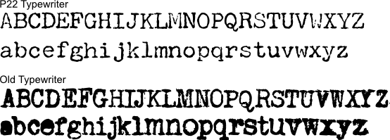
However, on a computer screen or on a modern printer, letterforms are perfectly reproduced. Printers and screens build letters out of patterns of dots in tiny grids. The dots making up letters are precisely placed and microscopic. Screen don’t splatter ink. In order to present an accurate typewriter font on screen or to be printed by a modern printer, font designers must also represent the types of errors that typewriters would make. You can see the messiness clearly in typewriter font samples.

Pangrams in a typewriter font

However, just as the sloppiness of typewritten documents reveals the typewriters that produced it, the computer reproduction of that error introduces another revealing mistake. While most letterforms produced by a typewriter are malformed, they are uniquely malformed. Like snowflakes, each letter printed by a typewriter is subtly different for every other letter. The computer reveals itself by reproducing the same messiness of a letterform each time it is reproduced.

A typewriter might produce the first o; in fact, a real typewriter was probably the source of that letterform. But no typewriter would produce that o identically twice. That takes a computer. To be very convincing, a typewriter font would need to produce different versions of each character or to distort them randomly. I’ve been told that there are now fonts that do exactly this.

While the imperfections of the typewritten characters reveals a typewriter, the reproduction of these errors with perfect verisimilitude reveals a computer. In the process of trying to emulate the errors created by a typewriter, the computer commits a new error and reveals the whole process.

Cross Site Descripting

Blogger Jordan Wiens recently noticed a funny thing about the Apple website. When one tries to search for “applescript” (Apple’s scripting and automation product) on Apple’s website, they end up with this search result:
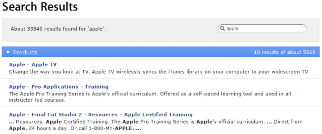
Applescript search results from Apple.com

Until the issue is fixed, you can see for yourself by navigating to http://www.apple.com/search/?q=applescript.

On the search result page, the Apple search software seems to change the term “applescript” into “apple.” A search for the term “apple” on the Apple website is, as one might imagine, not a particularly useful way to find information about Applescript. To most users, this error is confounding. To a trained eye, it reveals an overzealous security system attempting to prevent what’s called cross-site scripting or XSS — a way that spammers, phishers, and nefarious system-crackers can sneakily work around privacy and security systems in web browsers by exploiting two features of modern web browsers.

First, through the use of a programming language called Javascript, many web pages run small computer programs inside users’ browsers. These Javascript programs allow for applications that are more responsive than would have been possible before (think Google Maps for a good example). Running random programs is risky, of course. To protect users and their privacy, web browsers limit Javascript programs in several ways. One common technique is to limit access granted to a Javascript program from a given website to information from the site the Javascript originated at. This security system is designed to bar one website’s programs from accessing and relaying sensitive information, like login information or credit card numbers, from another website.

Second, a large number of applications allow input from users that is subsequently displayed on web pages. This can come in the form of edits and additions to Wikipedia pages, comments on forums, articles, or blogs, or even the fact that when you run a web search, the search terms are displayed back to you at the top of your page.

A security vulnerability, it turns out, lies in the combination of the two features. This vulnerability, XSS, happens when a nefarious user embeds small Javascript programs in input (e.g., a comment) which is run each time a page is subsequently viewed. Masquerading to the browser as a legitimate script created by the website creator, these programs can access sensitive information from the website stored on the user’s computer (e.g., login information) and then send this information to the author of the script without the violated user’s permission or knowledge.

When an attacker executes an XSS attack, they do so by trying to include Javascript in input that will be displayed to the user. This usually comes in the form of:

    <script>some code send to private information</script> 

In HTML, the “<script>” and “</script>” tags signify to the web browser that the text between is a program to be run.

XSS has become a large problem. To combat and prevent it, web developers take great care to protect their users and their applications from attacks by blocking, removing, or disabling attempts to include programs in user input. One frequently employed method of doing so is to simply remove the “<script>” tags that cause programs to be run. Without the tags, malicious code may remain, but will never be executed on users’ computers.

With this knowledge of XSS we can begin to understand the puzzling behavior of Apple’s website. By trying several other searches, we can confirm that Apple’s search engine is, in fact, removing all mentions of the term “script” from input to the site. The system is almost certainly designed to block XSS. While it is likely to succeed in doing so, the side effects, in the case of users searching for Applescript, are extremely inconvenient.

Through the error, Apple reveals their overzealous system designed to prevent XSS. Those who dig deeper to understand the source of this initially baffling behavior can gain new respect for implicit trust that that our browsers give to code on the websites we visit and the ways in which this trust can be abused.

In all likelihood, we have all been the victims of XSS attacks as users — although most of us have been lucky enough to avoid divulging sensitive information in the process. Apple’s error represents “collateral damage” in a a war fought between crackers, spammers, phishers on one side and web applications developers on the other. While we are rarely aware of it, this battle affects the way our web applications are designed and the features they do, and do not, include. We are, indirectly, affected by XSS even when we’re not looking for information on Applescript. By revealing one anti-XSS security system, Apple’s mistep points to that fact.

Thunderbird and the Nature of Spam

I found this beautiful and simple example of a revealing error featured in the fantastic (and very funny) Error’d series on Worse Than Failure:

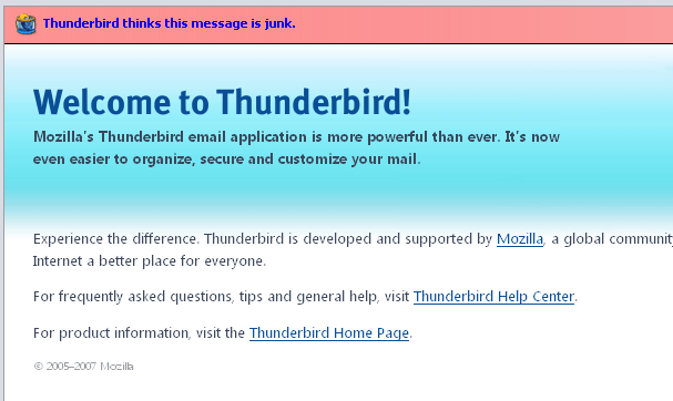
Thunderbird showing it's own welcome message as spam.

My guess is that before most users start the Mozilla Thunderbird email client for the first time, they don’t know that the software has a spam detection feature. That said, when the welcome message that automatically shows up in the inbox of every new Thunderbird user is prefixed by a notice that the message in question might be “junk,”, users’ ignorance on the matter will quickly be put to rest!

Of course, much more than the simple existence of the spam-flagging system is revealed by this error. With a little reflection, we can infer some of the criteria that Thunderbird must be using to sort spam or junk from legitimate email. Most mail systems, including Thunderbird use a variety of methods which, in aggregate, are used to determine the likelihood of a message being spam. Thunderbird’s welcome message is not addressed directly to the user in question and it makes extensive use of rich-text HTML and images — both common characteristics to spam.

Central to most modern spam-checkers is a statistical analysis of words used in the content of the email. Since spammers are trying to communicate a message, a prevalence of certain words and an absence of others is usually sufficient to sort out the junk. Sure enough, the Thunderbird welcome message is written using rather impersonal and marketing-speak terms that would be less likely in personal email (e.g., offering “product information”).

From the perspective of the Thunderbird developers, the flagging of this message as spam seems to be in error. From the perspective of the user though, it is not quite as clear. The Thunderbird message is both unsolicited and commercial in nature — essentially the definition of spam. In the “looks like a duck” sense, it uses words that make it “read” like spam.

While this simple error can teach Thunderbird users about the existence and the nature of their spam-checker, it might also teach the folks responsible for the Thunderbird welcome message something about the way the their messages might seem to their users.

Identity Crisis

This error was revealed and written up by Karl Fogel.

Yesterday I received email from a hotel, confirming a reservation for a room. But it wasn’t meant for me; it was meant for “Kathy Fogel” (whom I’ve never met), and was sent to “k.fogel@gmail.com”.

Now, I do have the account “kfogel@gmail.com”, but I’d never received email for “k.fogel” before. As I’d always thought “.” was a significant character in email addresses, I didn’t see how I could have gotten this mail. It turns out, though, that Google ignores “.” when it’s in the username portion of a gmail address. My friend Brian Fitzpatrick knew this already, and pointed me to Google’s explanation. (I learned later that others have been suprised by this behavior too.)

So the error revealed a feature — at least, I’m fairly sure Google would consider it a feature, although the exact motivation for it is still not clear to me. It might be a technical requirement caused by merging several legacy user databases, or it might simply be to prevent confusion among addresses that only differ by dots.

Anyway, I called the hotel, and eventually managed to make them understand that I had no idea who Kathy Fogel was, and that I’d accidentally gotten an email intended for her. They said they’d resend, and of course I said “Wait, no, it’ll just come to me again!” But they swore they had a different email address on file for her, and indeed, I haven’t gotten a second email.

Which raises another question: how did they send the mail to “k.fogel@gmail.com” in the first place? Clearly, Kathy Fogel cannot have that address, because Google will not allow any other “dot variants” of an address to be registered after the first. (Besides, if she did have that address, we’d be getting each other’s mail all the time, and we’re not.) It’s also unlikely that she mistakenly given them that address herself, since they already had another address in place by the time I called.

A computer wouldn’t substitute domain names in an email address like that. The only thing I can think of is that somehow, humans are, at least in some cases, intimately involved in sending out confirmation emails from DoubleTree hotels. I say “intimately” because this was no mere cut-and-paste mistake. Someone had to transcribe an email address by hand, and accidentally put “gmail.com” where the original said “yahoo.com” or “aol.com” or whatever.

I hope Kathy has a nice trip.

Computer Generated Crossword Puzzles

There are two free daily newspapers in Boston. The Boston Metro and the Boston Now. Both run crossword puzzles. The Now runs a puzzle edited by Stanley Newman. The Metro’s puzzle is unattributed. When my friend Seth Schoen was in town for several days, he did several crossword puzzles in the Metro. He pointed out to me that a clue in the crossword was repeated on two consecutive days. The crosswords in the Metro, he concluded, were computer generated.

I picked up the Metro each day for several weeks and, sure enough, there was a large amount of overlap in answers. “ALSO” and NIL” were answers three times in two weeks. More suggestive, however, were the clues. In all three instances of each repeated answer, the clues were the same. The clue for “ALSO” was always, “Part of a.k.a.,” while the clue for “NIL” was “Zilch.” Capitalization and punctuation, even for the uncapitalized “a.k.a.”, was consistent. Despite the fact that there was some variation in clues, I found some answers with different clues on different days. The high degree of consistency was undeniable.

Unassisted by a computer, no human editor would use the same clue for puzzles two days in a row. Frequent reuse of clues makes puzzles too easy for regular players and slight variation in clues is easy for a human puzzle editor to do. But even if the puzzles had been written in a different order than they were run in the paper, it is unlikely that a puzzle maker would repeatedly have come up with the same clues. The chance of capitalization, phrasing, and style resulting in identical clue text is even more improbable. Humans simply aren’t that consistent. Computers are. Through the reuse of the clues, a computerized provenance is revealed.

Perhaps a little ignorant, I’d always assumed that crosswords were human generated. In fact, computer generated crosswords are widespread. There have been published papers on computer generation of crosswords since the 1970s and a New York Times article on the subject was published in 1996 when the practice was beginning to take off. Computers are able to generate puzzles quickly and in quantity and, as a result, are in common use in magazines and on websites.

There’s resistance, however, from both human crossword editors and from solvers who find computer generated puzzles unsatisfying. Great crossword puzzles, they argue, showcase wit and creativity with language; answers are often tied together by themes and wordplay. Computers excel at taking a database of answers and creating grids that match up correctly; they are much faster and more accurate than humans. But as the error that revealed the computer to my friend Seth illustrates, computers are less adept at varying when or how they employ answers and clues in puzzles.

Quoted in an article in Tulsa World, Mark Lagasse, senior executive editor with Dell Magazines, justified his magazine’s choice to fund the more laborious human methods of crossword production saying, “with themes and the better, larger puzzles, it’s best to have a constructor working them out and filling in the diagrams. A lot of the words are a bit more dry and boring when done with computers.” Ultimately, he concludes, computer-generated puzzles simply are not as entertaining as those made by humans.

I did the crossword puzzles in both the Now and the Metro for a couple weeks and I agree with Lagasse. The human generated puzzles are less repetitive, more interesting, and ultimately more satisfying. The computer generated puzzles almost never use word play and have no thematic connections between answers or clues. Of course, I did both Metro and Now puzzles in the past and I always preferred the Now puzzles and found them more fun. But I would have been hard-pressed to justify my feelings. It was not until Seth pointed out the repeated clues, an error, that I was able to understand why I felt the way I did.

Only Yesterday

I only recently stumbled across this old revealing error in the wonderful Doh, The Humanity! weblog:

It may seem like only yesterday (Wednesday, 26 July) when...

In the days of newspapers and broadcast media, it was only likely for someone to read a news article on the day it was published. If the publication were weekly or monthly, it would be reasonable to expect readers got to it within the week or month. While libraries and others might keep archived versions, it was always clear to readers of archived material that their material — and any relative dates mentioned therein — were out of date.

Even today, news is still written primarily be consumed immediately and the vast majority of readers of an article will read it while it is fresh. But, websites have made archived material live on for months and years. While this is generally a good thing, it creates all sorts of problems for people who use relative dates in articles. The point of reference — today — becomes unstable. As a result, if an entertainment reporter describes a show as happening, “next Tuesday,” it might appear to refer to any number of incorrect Tuesdays depending on when someone has stumbled across the archived version.

News companies have responded by converting relative dates into absolute ones. No doubt, this was often done by editors but today is also done by computer programs. These programs parse each news story looking for relative dates. When they find one, they compute the corresponding absolute date from the relative one, and add it into the text of the article in a parenthetical aside.

Most people, including myself, never knew or even imagined that articles were being parsed like this until the system screwed up as it did in the screenshot above. No human editor would have thought to provide an absolute date for “yesterday” in the phrase, “it may seem like only yesterday.” With this misstep, the script at work is revealed. With the mistakes, the program’s previous work — hopefully more accurate and less noticeable in old articles — becomes visible as well. Since seeing this image, I’ve noticed these date absolutefiers at work everywhere.

Technology-Assisted Deception

This error was revealed and written up by Aaron Swartz.

When I told a friend about this project, she (let’s call her Alice) told me a story.

Alice lives a major city with fairly good cell coverage, except for a long tunnel that goes underground. Alice often gets calls from her mom. Alice likes her mom, of course, no problems there, but, as we all do, finds long phone calls with her a bit trying. So often when she’s on the phone with her mom, Alice will say “Oops, sorry mom, got to go into the tunnel now!” Even when she’s not going into the tunnel.

This is a lie that new technology makes possible. But it only makes it possible because there are known failures in the technology. If we only had old landline phones, you’d never be able to claim such a thing — landline phones don’t randomly stop working. And if we had perfect cell coverage, it similarly wouldn’t make sense. But since the technology only half-works, the unfinished space can be used for very human forms of deception.